

A fresh new look for our Item pages for even better data discovery
-
 Feature Note
We’re launching a significant update to Zeenea’s Item pages’ design. Some shiny new things, some old things in new places, and general cleaning of the placement of information. These changes address a fundamental challenge that has evolved naturally with Zeenea: discovering data quickly. Indeed, as the volume of enterprise data increases, it can be overwhelming for data consumers to rapidly & efficiently find the information they need when an Item has hundreds of fields, associated Glossary Items, properties, etc.
This is why Zeenea’s Item pages in the Explorer app have evolved! In this feature note, discover our new interface and how it helps data consumers discover (even better!) their data for their business use cases.

Understand your Item in a glance
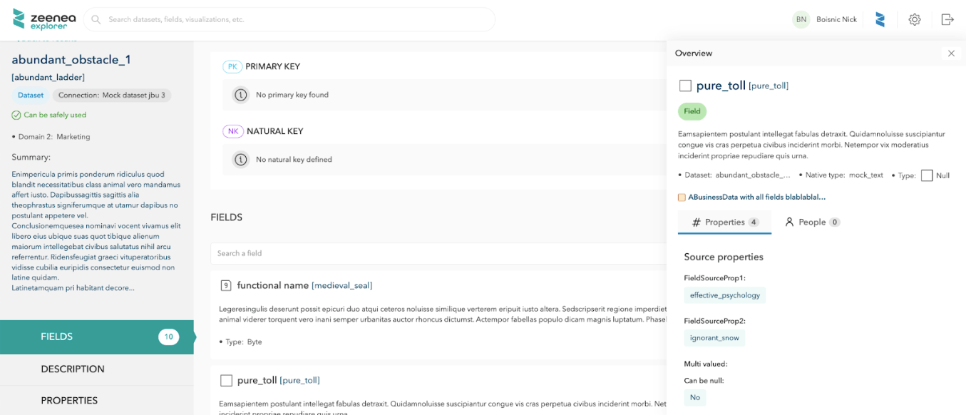
One of the most notable changes is the position of the Item’s tabs. The tabs were originally positioned on the left-hand side of the page, which took up a lot of space. Now, the tabs are at the top of the page, more closely reflecting the layout of the Studio app.
This new layout allows data consumers to find the most significant information about an Item such as:
- The highlighted properties, defined by the Data Steward in the Catalog Design,


- Key people, to quickly reach the contacts that are linked to the Item.

This section of the page always stays available no matter the tab you’re on or how far you scroll down.

Find all fields, metadata, and all other related items instantly
Divided into three separate tabs in the old version, data consumers now find the Item’s description and all related Items in a single “Details” tab. Indeed, depending on the Item Type you are browsing through, all fields, inputs & outputs, parent/children Glossary Items, implementations, and other metadata are in the same section, saving you precious data discovery time.

However, not everything changes:
- The Fields list remains searchable for you to quickly find the fields you need,


- For Glossary Items, you may still view your hierarchies via a graph or list format but now they are interchangeable – just click the button to change the view instead of scrolling down.

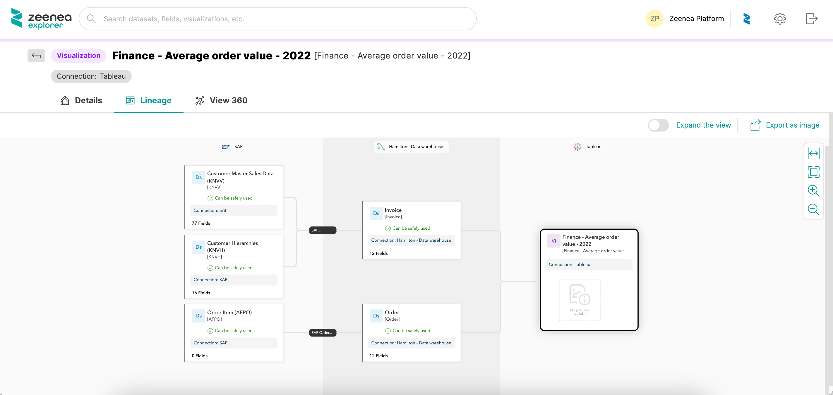
Larger space for the graphical components
Your Lineage, 360 View, and Data Model diagrams stay the same user-friendly graphs. The only difference is that you now have more room to see your information.